Identity in the making.
A new school needs more than a name. It needs familiar signs, shared stories and materials that help a community feel at home.
My contributionSchool identity development & visual communication
The purpose
Alongside my caretaker committee work, I contribute to the visual materials and digital presence of SK Bandar Putra 2. These examples show how the school identity develops across design exploration and everyday communication.
From draft to application
The early logo sheet captures an exploratory stage. The crest in use, the dimensional presentation, the book cover and the song poster show later expressions of the school’s identity. Each image is presented in full, with its stage clearly identified.
The work, in view.
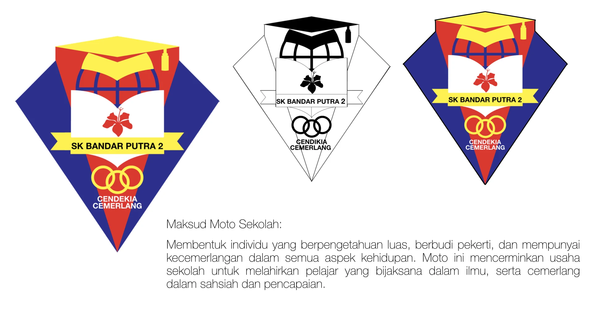
The early logo draft.
An early design sheet exploring colour, composition and the school motto. This is a development draft; the crest evolved before appearing in use.
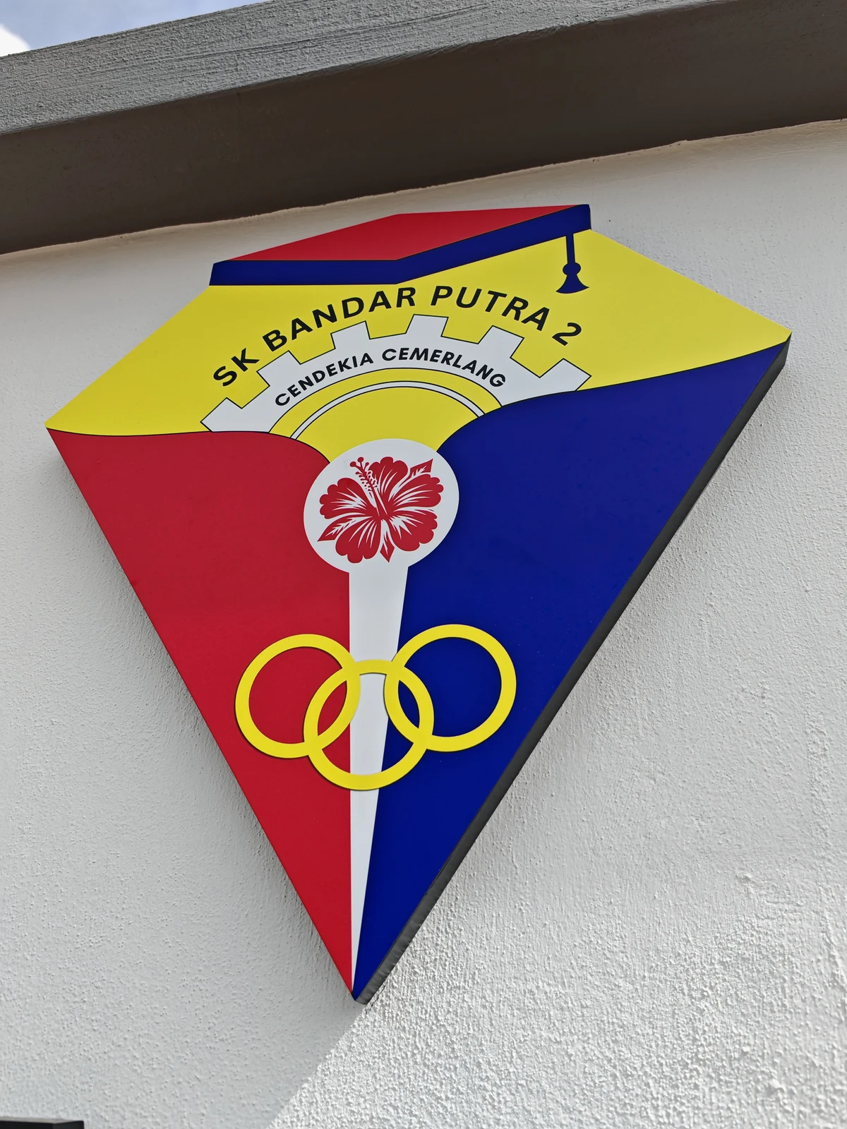
From a design to a place.
The school crest photographed on site. Its red, blue and yellow palette and “Cendekia Cemerlang” motto make the identity visible in the school environment.

Another view of the crest.
A dimensional presentation of the crest, showing the school name, motto and recognisable forms in a different visual treatment.
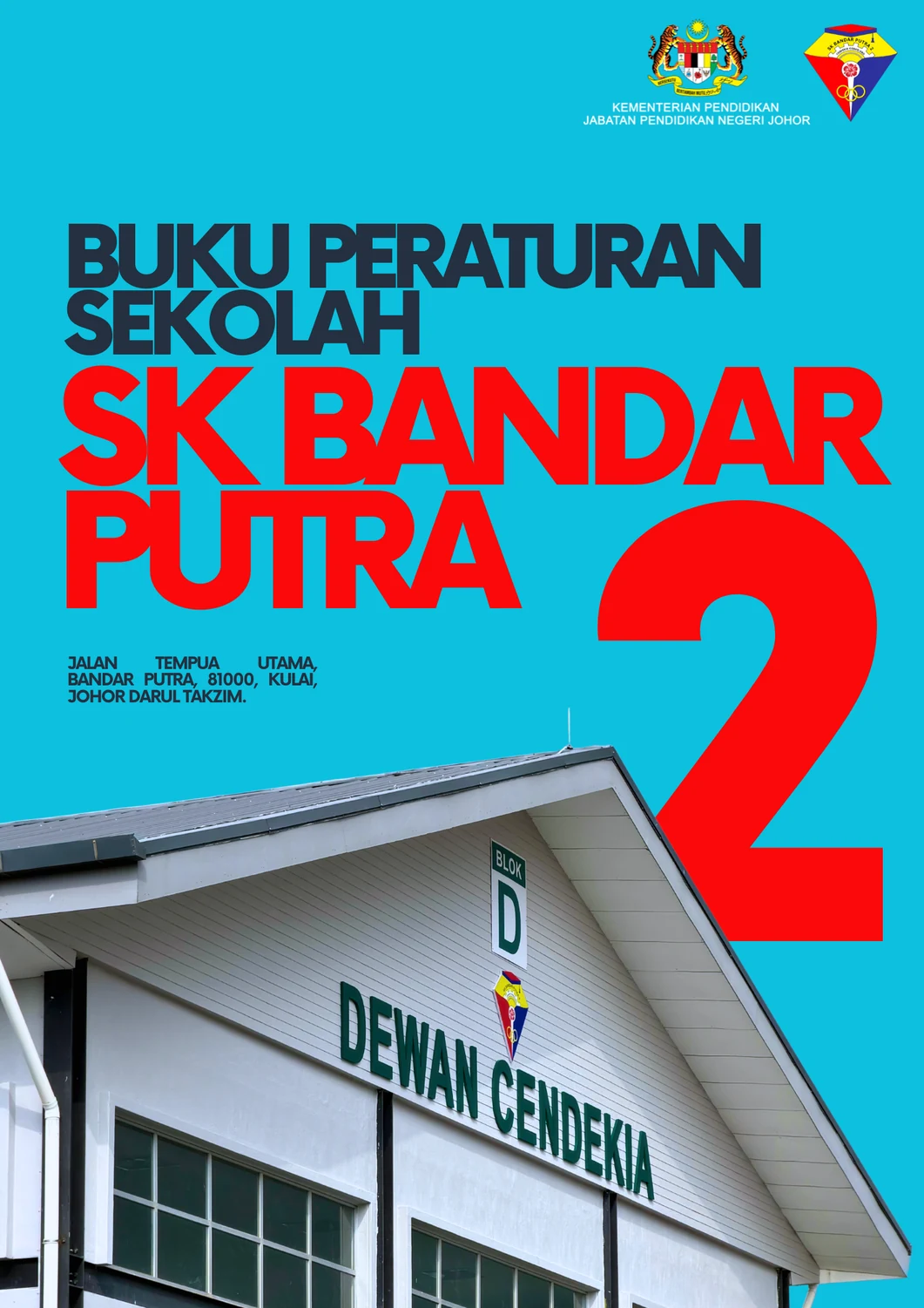
A cover with a clear identity.
The school rules book cover brings bold typography, the school crest and a photograph of Dewan Cendekia into one practical school publication.
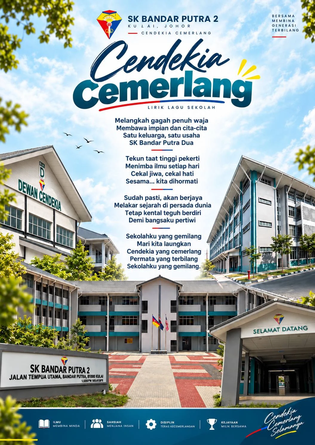
Cendekia Cemerlang, in print.
A school song poster brings lyrics, photographs and the school identity together. The finished layout gives the community a shared visual reference.